I Built a Fully Playable Hive Game in One Conversation with Claude
And then made it work on iPhone, wrote a README, generated a Unix man page, and somehow ended up here writing a blog post about all of it.
I’ve been a fan of Hive for years — it’s one of those games that looks simple on the surface (place bugs, surround the queen) but has this deep strategic texture that sneaks up on you. It’s also famously hard to implement digitally, because the rules are deceptively intricate. The One Hive Rule alone — the constraint that no move can ever split the pieces into two disconnected groups — is something even experienced programmers have to think carefully about.
A few days ago I decided to see what would happen if I just… asked Claude to build it.
The Ask
I typed: “Create an online version of the game Hive.”
That’s it. No spec, no wireframe, no list of requirements. Just the game name.
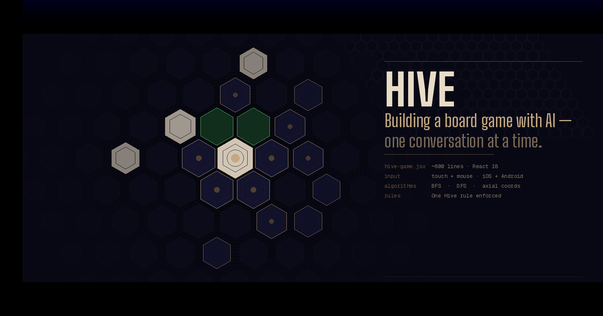
What came back was a single React JSX file — about 550 lines — implementing the complete game: all five piece types, correct movement rules for each, the One Hive rule, the sliding freedom (gate) rule, the Queen placement deadline, win detection, draw detection, a pannable hex board drawn in SVG, and a two-player local interface with piece hands displayed on either side.
I want to dwell on that for a second, because it’s easy to gloss over. Hive has five different movement algorithms. The Ant can move anywhere. The Grasshopper jumps in straight lines. The Spider moves exactly three steps with no backtracking. The Beetle climbs. The Queen slides one space. Each one needs its own logic, and each one needs to interact correctly with the One Hive rule. Getting that all right in one shot, without being walked through it, is genuinely impressive.
The visual design was also better than I expected: a dark, muted palette with gold accents, hex pieces colored white or near-black for each player, green highlight dots for valid moves, and a gold glow on selected pieces. It looked like a real game, not a prototype.
The Hex Math Problem (And Why It’s Interesting)
One of the things I found myself reading through was how hexagonal coordinates are handled. If you’ve never thought about this: hexagonal grids are much harder to work with than square grids because there’s no obvious “row and column” system that maps cleanly to how hexagons actually tile.
The code uses the axial coordinate system — every hex gets two numbers, q and r, sort of like longitude and latitude but for a hex grid. The six directions you can move from any hex are hardcoded as offsets:
const DIR = [[1,0],[1,-1],[0,-1],[-1,0],[-1,1],[0,1]];
Converting those coordinates to actual pixel positions on screen requires a formula involving √3, because hexagons are built on 60° angles. And converting back from a pixel tap position to a hex coordinate — needed every time the player taps the screen — requires the inverse formula plus a rounding function called cubeRound that snaps a floating-point position to the nearest hex center.
None of this is exotic mathematics, but it’s the kind of thing where a small mistake produces bugs that look totally mysterious — pieces that can’t be selected, clicks that register on the wrong hex, that sort of thing. The implementation got it right.
Then I Pulled Out My Phone
The desktop version worked great. I opened it on my iPhone and nothing happened when I tapped.
This is a genuinely common iOS gotcha. Mobile Safari fires touch events, not mouse events. The original code only had onMouseDown, onMouseMove, onMouseUp handlers. On iOS, those don’t fire for touch. You need onTouchStart, onTouchMove, onTouchEnd — and you also need to call preventDefault() on them, or iOS will intercept the touch for scrolling or zooming before your code ever sees it.
There were a few other mobile issues too: the fixed board width (680px) overflowed a phone screen, the status bar had a minWidth that caused the same problem, and the piece hands flanking the board on either side made no sense on a narrow display.
I typed: “Make it work on an iPhone. It’s not responding to touch.”
The response was a complete rewrite of the interaction and layout systems:
Touch fixes applied:
onTouchStart,onTouchMove,onTouchEnd,onTouchCanceladded to the SVG elemente.preventDefault()called on every touch handler to stop iOS from hijacking themtouch-action: noneset on both the SVG and its container-webkit-tap-highlight-color: transparentto remove the 300ms tap delay blue flash- The hand buttons got
onTouchEndhandlers too, so they respond instantly without the usual 300ms iOS delay
Layout fixes:
- Board width changed from a fixed
680pxtowindow.innerWidth - 4on mobile - Hex tile size reduced from 36px to 28px on narrow screens
- Both player hands moved below the board (side by side) instead of flanking it
100dvhused instead of100vhto handle the iPhone’s dynamic address baruseWindowSize()hook added to watch for screen size changes
The tap-to-hex math also needed updating. The original code used an SVG onClick handler, which doesn’t fire reliably on iOS when touch events are active. The new version uses a unified onEnd handler that triggers for both mouseup and touchend, reads the touch coordinates from event.changedTouches[0], and runs the pixel-to-hex conversion from there.
After this fix, it worked perfectly on my phone.
Writing the Documentation
At this point I had a working game. On a whim, I decided to see what Claude would do with documentation requests.
The README
“Create a readme that explains how the code works at a high school level.”
The result is one of my favorite things from this whole experiment. It’s a genuine technical document — it explains BFS and DFS, the One Hive connectivity check, the axial coordinate system, the inverse pixel-to-hex formula — but framed with analogies that don’t require a CS degree:
BFS = “visit all reachable neighbors, one ring at a time.” It’s like flood-filling a region in a paint app.
Think of it like a street address: instead of “123 Main St”, a hex might live at “3,-1”.
It has code snippets, a table of the React state variables, and a step-by-step walkthrough of the turn flow. It reads like something a patient senior engineer wrote for an intern on their first day. I’ve worked at companies where the internal documentation was worse than this.
The Man Page
This one was just for fun. “Now create a unix man page for it.”
A Unix man page is a specific document format — written in a typesetting language called groff — that has been the standard format for command-line documentation since the 1970s. Asking for one for a browser game is a bit absurd, which is part of why I wanted to see it.
The result was hive.6 (section 6 of the manual is traditionally Games), complete with all the standard sections: NAME, SYNOPSIS, DESCRIPTION, PIECES, RULES, CONTROLS, EXIT STATUS (with a deadpan note: “Closing the browser tab terminates the session”), COORDINATE SYSTEM with actual typeset math, IMPLEMENTATION NOTES with Big-O complexity for each piece’s movement algorithm, BUGS (noting the missing Mosquito/Ladybug/Pillbug expansions), and SEE ALSO including chess(6), go(6), and react(3js).
The groff syntax was correct — valid macros, proper section structure, .TP for tagged paragraphs, .RS/.RE for indented blocks, .nf/.fi for the no-fill math section. If you have groff installed you can render it with:
groff -man -Tascii hive.6 | less
I don’t know why this delighted me as much as it did, but it did.
What I Took Away From This
A few things stood out to me:
The hardest part was already handled. The movement algorithms — especially Spider’s depth-first search and the One Hive connectivity check — are the pieces that would take a programmer the longest to get right. They were correct on the first attempt. The mobile touch stuff was a known class of problem with known solutions; that’s more of a “did you remember the checklist” issue than a “can you solve this problem” issue.
Iteration happened in plain English. I didn’t write a bug report or a GitHub issue. I said “it’s not responding to touch” and the response addressed not just the literal problem but the whole class of related issues (layout, tap delay, coordinate reading) that a good developer would fix in the same pass.
The artifacts traveled together. By the end I had a game, a README, and a man page — three completely different document formats, each appropriate for a different audience, all accurately describing the same system. That kind of coherent documentation across formats is something engineering teams aspire to and rarely achieve.
I still had to know what to ask. The iPhone fix worked because I knew enough to frame the problem correctly (“not responding to touch” rather than “doesn’t work on mobile”). The man page was only as good as the prompt. None of this replaced knowing what you’re doing — it accelerated the doing of it.
The Files
If you want to run it yourself, everything lives in one JSX file. Drop it into a React project (or a CodeSandbox), and it works. No dependencies beyond React itself.
hive-game.jsx— the full gameREADME.md— technical walkthrough at a high-school levelhive.6— Unix man page (render withgroff -man)
The whole session — game, iPhone fix, README, man page, this post — took about twenty minutes of wall clock time.
Have you built something interesting in a single conversation? I’d love to hear about it.